


Designing has never been more critical in a space and time where websites have become the digital equivalent of flagships. And that statement stands to reason—we've never asked so much of aesthetics and functionality in the digital world.
At its core, a well-designed website is expected to be the comprehensive nucleus of nearly everything a SaaS business tries to achieve, from generating leads to providing helpful information. And although plenty of companies do at least some things right when it comes to SaaS web design, there are plenty more that throw best practices—and good taste, for that matter—right off the monitor and out the window.
Although there's no one-size-fits-all method for B2B SaaS website design, some universal elements apply across the board, such as using colour, imagery, and placement or even leveraging subtext. Beyond that, just as many are only essential in context—and understanding how and why they can make or break important decisions in the future.
So to provide some real insight into a concept that has so much variance, we've decided to focus on a select few that we think will give the best SaaS website design inspirations and explain why they work, so you can glean as much as possible, apply them to your efforts, and hopefully enjoy similar success.
Criteria for Excellent SaaS Website Designs
Clean and Clear
A cluttered website design for SaaS is like a messy room—it is difficult to find what you're searching for and can be overwhelming. Your site should have a clean, straightforward design, easy-to-understand content, and a simple navigation menu.
You're screwed without a website maintenance plan, so be sure to put one in place.
Limit using too many colours or fancy fonts that make your website look like a circus.
Keep it simple, and your visitors will thank you!
Responsive and Mobile-Friendly
In today's digital age, people access websites on all devices—from desktop computers to smartphones and tablets. When searching for SaaS website design inspiration, you'll notice that every example is mobile-friendly and responsive.
Ensuring your website looks great and works seamlessly across all devices is imperative. Don't make your visitors pinch and zoom to read your content or click on buttons. Instead, ensure the website adapts to different screen sizes and provides a smoother experience, no matter how your audience accesses it. A team of Webflow developers can help you achieve this responsive design effortlessly.
Unique and Memorable
Your SaaS website design should be as distinctive as your software solution. Avoid utilizing copy-and-paste SaaS website templates or generic stock images so that your site doesn't look like everyone else's.
Investing in custom illustrations, photos, or graphics that reflect the brand's personality can make its website truly one of a kind. Add clever, witty elements that make visitors smile and remember your website long after they've left. Strong brand identity design ensures visual consistency across layout, typography, and colour choices. Some sites, like Superside, demonstrate how maintaining this consistency can create a more cohesive and user-friendly experience, without relying on overly decorative or complex design.
Call to Actions That Rock
A call to action (CTA) is like the icing on the cake of your SaaS website. The link or button tells the visitors what to do next—whether it's getting in touch with sales, downloading an ebook, or signing up for a free trial.
The CTA should be eye-catching, prominent, and witty. You could say something boring like, "Sign Up Now," but why not try something like "Join the Cool Kids Club" or "Let's Get this Party Started!"
Get creative and have fun with your CTAs—it's an opportunity to make your visitors smile and take action.
SaaS Website Design Tips
Grab Attention
Your website should grab visitors' attention faster than a cheetah on a caffeine high. Use bold colours, captivating visuals, and witty headlines to make the site stand out.
Try adding some surprises that make your visitors go, "Wow!" A hilarious GIF or hidden easter egg that pops up when they least expect it is a great way to keep your audience engaged.
After all, who said your software couldn't be fun?
Social Proof
Do you want visitors to trust your brand? Social proof is the secret potion that assists in filling that void.
Anything from happy customers' testimonials to case studies and success stories can show visitors why they should choose your software over others.
Here are some benefits of showcasing social proof on your SaaS website:
- Enhanced credibility
- Improved conversion rates
- Enhanced brand image
But why settle for mundane testimonials when you can have fun with them? Ask your clients to share their feedback humorously or creatively; that makes your visitors laugh and builds trust simultaneously.
Storytell Like a Boss
Your brand's story is like juicy gossip visitors can't get enough of. Use engaging and compelling copywriting to tell your brand's story in a memorable and shareable way. Don't hesitate to inject personality, wit, and humour into the content.
Below are a few reasons to storytell like a boss:
- Engage and connect with visitors
- Differentiate from competitors
- Communicate value and benefits
- Drive emotion and action
Share case studies or anecdotes that make visitors cry, laugh, or high-five their screens. Be a storyteller and give your visitors high-quality brand stories that leave them craving more.
Considerations for SaaS Website Redesign
The Content Conundrum
Quality over quantity is the name of the game when it comes to content. Don't be afraid to give your website's articles a makeover when redesigning the SaaS website. Say goodbye to long-winded paragraphs that put your visitor to sleep faster than a lullaby.
Instead, opt for succinct content that keeps visitors entertained and engaged long enough to take action.
The table below highlights a few reasons to consider content conundrums during a website redesign and their advantages.
|
Reasons to Consider the Content Conundrum During the SaaS Website Redesign Process |
Advantages |
|---|---|
|
Outdated or Irrelevant Content |
Updating and refreshing content can ensure that it aligns with your current SaaS marketing positions, target audience, and business objectives. |
|
Inconsistent Brand Message |
You can reinforce your brand identity and aid users in understanding your value proposition by ensuring the brand message is consistent across your website |
|
Poor Content Organization |
Well-organized content can improve the user experience by making it easy for visitors to find relevant information, increasing engagement and reducing bounce rates. |
If you get stuck in a rut, you can always check out the best content writing tools for SEO to give you a competitive edge.
Use Videos and Images
Do you want to know a fantastic method to increase your website's visual appeal?
Try including high-quality images and videos.
Here are some do's and don't of adding images and videos to your SaaS website:
|
Do's |
Don't |
|
Optimize images and videos for web performance, ensuring smooth playback and fast loading times |
Utilize large file sizes or formats that result in buffering issues or slowing performance. |
|
Include captions and alt tags for images to improve SEO and accessibility. This can be done for subtitles and transcripts for videos to further boost the user experience. |
Neglect subtitles, transcripts, captions, and alt tags, making it challenging for SEO purposes or challenging for visitors with a disability. |
|
Strategically place images and videos on the website, such as testimonials, product pages, and landing pages (see our SaaS landing page design examples) to enhance conversions and user engagement |
Randomly place videos and images without considering their impact or relevance. |
A picture tells a thousand words, so you can imagine the effect a video can have. Both mediums can also aid in explaining complex concepts and make the site more attractive to visitors. When choosing videos and images, ensure they are relevant to your posted content and don't interfere with the page's loading times.
Keep It Simple
SaaS Website designs with minimal elements are a common sight these days, and rightfully so. It's easier for visitors to engage with an intuitive site, and this can also assist in lowering its bounce rate.
While busy with the SaaS website redesign, ensure the interface is straightforward to use, with content and elements arranged in a way that makes sense to visitors.
10 Great SaaS Website Examples
Coupa
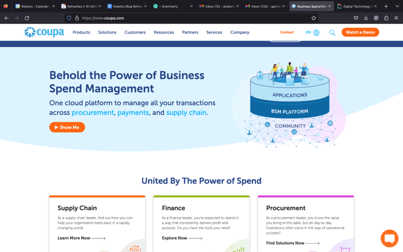
Strongest Element: Ease of understanding the offering
Coupa delivers value, clarity, and insight right from their home page. Outside of providing a well-crafted explainer video that clocks in at a near-perfect 50 seconds, they give visitors their value prop from the second they hit the site. Language like “Spend Smarter” backed by the idea of getting both visibility and control out of business spending, especially paired with the underlying video clips, gives the perfect taste of the offering. The swooshing design below creates the perfect space to deliver a key tagline: The All-In-One Business Spend Management Platform.
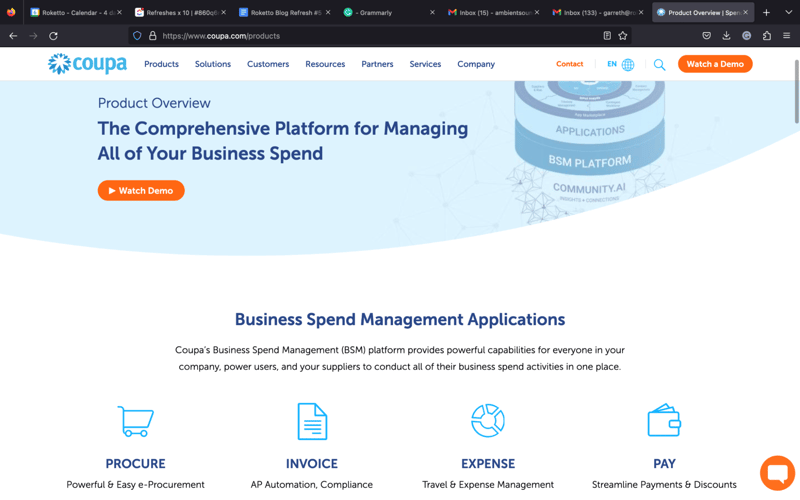
Other Strengths
- Cohesion and design consistency: Excellent use of colour to draw the eye to key elements like CTAs and buttons to explore the site as well as perfectly consistent use of shape and hover-overs.
- Simple: Clean illustrations of the offering in use shows users what to expect out of the interface.
- Great use of language: “What are you looking to do?” followed by a categorized selection of services and capabilities shows a customer-centric approach.
- Straightforward design: Layout makes navigating to any facet of the site exceptionally intuitive.
- The Explore & Learn section: Offers resources for folks in every stage of their journey and even links to high-value gated offers.
Freshbooks
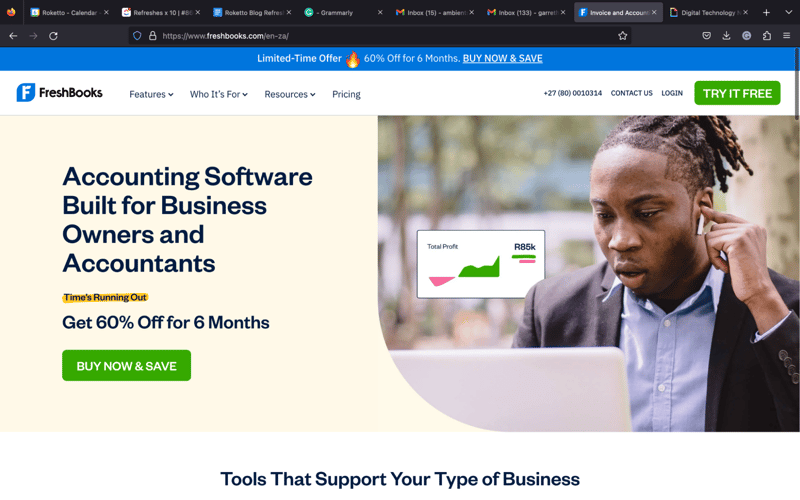
Strongest Element: Clean, simple view of a comprehensive solution
Although Freshbooks' offering has tons of features, they've found a simple, straightforward, and insightful way to put it all into context right on their home page. Just underneath a well-crafted value prop, complementary image, and a carefully crafted short list of high-view benefits, Freshbooks not only breaks down all of its solution's handiest features but includes a first-hand look of the interface in action with every example perfectly showcasing how simple yet powerful it really is—not to mention aesthetically pleasing!
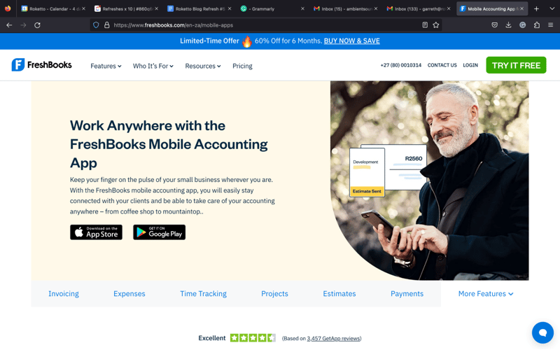
Other Strengths
- Overall design: The site overall is clean, simple, and tasteful. It uses a modest palette derived from the logo that gives it a cohesive feel that is never too in your face.
- Social proof is evident but tasteful. The landing spot on the home page has reviews subtly tucked away but easily accessible, a gray bar underneath the main image shows that big brands have taken notice, and further down, there are good quotes from actual clients.
- Blog style breakout boxes underneath the social proof appeals to and invites both individuals and entire teams/businesses.
- Strengthens the ease and simplicity of the offering by highlighting mobile use and integration.
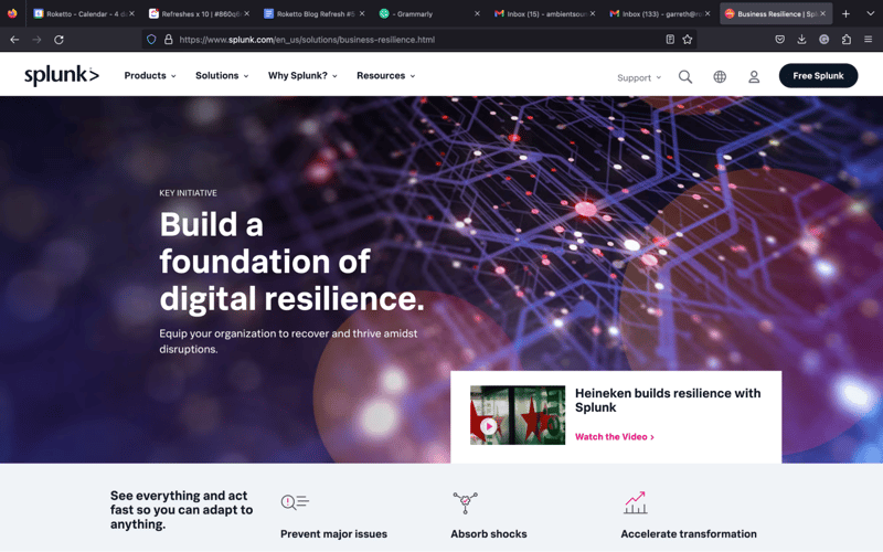
Splunk
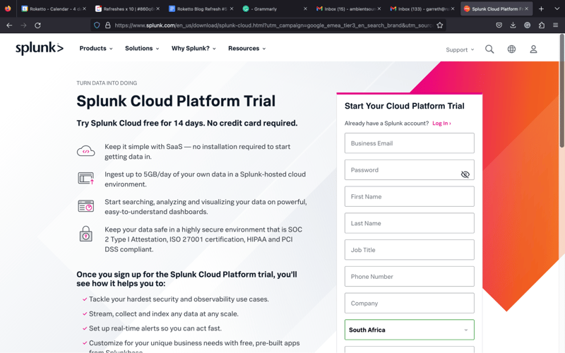
Strongest Element: Turning complexity into simplicity
Not all SaaS businesses have the luxury of a simple and straightforward product, but that doesn't seem to stop Splunk. Despite deep offerings in IT, IoT, security, and business analytics, they've done everything possible to keep visitors from getting overwhelmed on their site. A first visit introduces their solution, The Data-to-Everything Platform, then the Find Out How button immediately directs visitors to a combination explainer video/case study that exemplifies their offering in a context more familiar to most than something like IoT: cars. This is a recurring theme throughout their site, as they pair digestible images with simple explanations and round it all out with helpful videos to make sure visitors understand the complexity of their offering in the easiest way possible.
Other Strengths:
- Subtext: Drawing the strongest parallel in their offering with what they've been able to do with Porsche is a clever approach in general. High-performance data with high-performance vehicles. And there are a few more sprinkled in this way throughout the site.
- Segmenting information: There's a lot to understand about Splunk's solutions, but their ability to provide short segments of information with helpful imagery that exemplifies use is key to presenting complex ideas in a digestible way.
- Color psychology: Both pink and orange are both active colours, the former representing nurturance and stimulation, the latter enthusiasm and energy, all of which plays into their branding and what they're trying to represent.
- Language: Outside of frequently using active verbs, Splunk seems keenly aware of the space they exist within and who their customers are—complex and likely unfamiliar, respectively. Hence, using phrases like “ride the data wave” indicates that folks need to jump in to keep pace with the competition, while “turn data into doing” makes their complex offering actionable for nearly anyone.
- Aesthetics: Top to bottom, page to page, this site does a great job appropriately balancing text and imagery, colour, spacing, layout, and everything in between. It's intuitive and easy to navigate, and the visual elements present make it a pleasure to poke around.
Best SaaS Web Design Inspiration for: Identity and Purpose
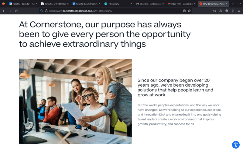
Cornerstone
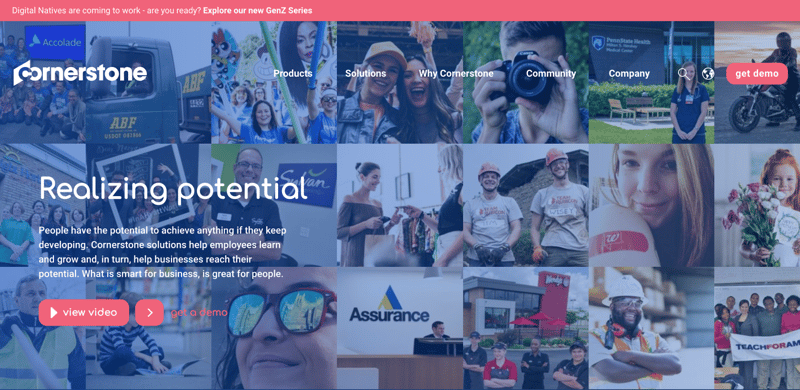
Strongest Element: Leveraging brand purpose and identity
The moment you land on Cornerstone's site, there's no doubt that they are all about people. Between the softened background full of smiling images and language like “realizing potential”, Cornerstone drives home the idea that personal and professional growth aren't mutually exclusive. This work-life balance is reinforced in text and images—and therefore subtext—throughout the site. Even their navigation bar has a link to their community-based elements and resources.
Other Strengths
- Clever use of shape: While the Cornerstone logo is angular and implies strength and structure, most of the other shapes throughout the site, whether buttons, breakout boxes, or even the font, are rounded, again reinforcing the concept of blending personal and professional.
- Knowing their audience: Instead of showcasing what clients they work with right up top, Cornerstone highlights being recognized for things like diversity and work environment.
- Layout and spacing: The site as a whole, especially the home page, wastes little space, yet never becomes overwhelming. It's pleasant to scroll through and navigate and it's logically laid out in terms of introducing the information.
- Fourpart, timeline-style design: perfectly exemplifies the four pillars of their specialization in talent management in a way that's easy to read, visually pleasing, and perfect for navigation.
- Navigation bar: It has great titles that exemplify brand identity but also top-notch categorization. Ex: Why Cornerstone includes Our Expertise, Client Experience, Industry Recognition, and Partners.
Blackbaud
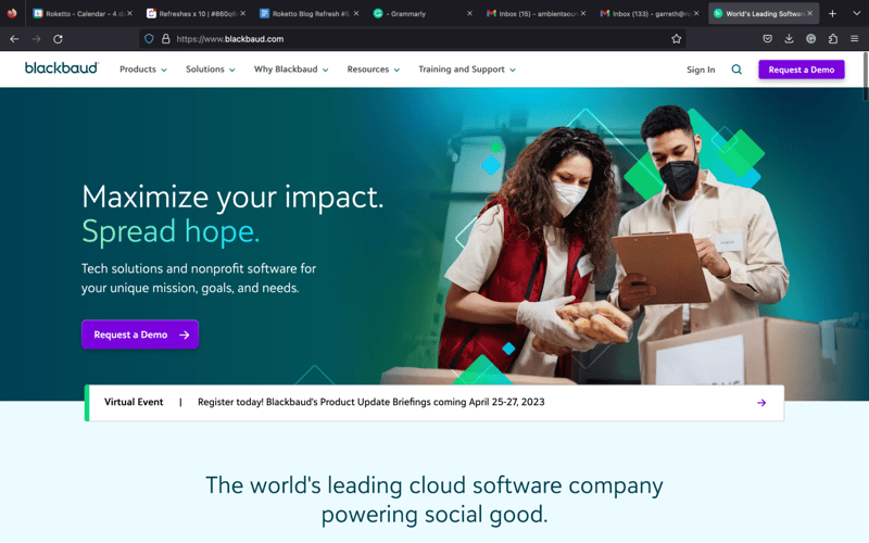
Strongest Element: Defining purpose
Much like Cornerstone, this SaaS website design inspiration's website leaves an immediate and unquestionable impression on its visitors, making the company's purpose exceptionally clear: they want to use their business to make the world a better place. Just below the main image, Blackbaud supports this idea further by sharing related accolades and then introducing their solution with compelling language and content centred around driving impact for social good, like the “Build a Better World” button, which directs visitors to a comprehensive look at their vision and purpose. Everything about their site, from images to text and subtext, shares the same positive messaging, not just about what they do—but why.
Other Strengths
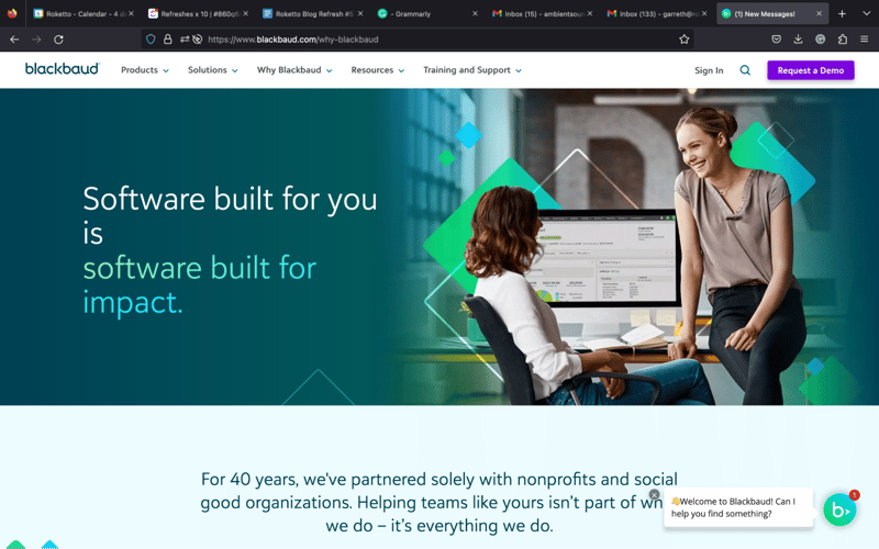
- Use of color psychology: green, representing growth, harmony, wealth, and stability; blue, representing cleanliness, trust, and intelligence; gray, representing professionalism—all speak to what they do. Plus, the use of gradients is visually appealing.
- Use of imagery: Out of all the sites we looked at, few have images that speak to their identity, clients, and their offering, as well as Blackbaud. Nothing feels generic, the images certainly feel very specific to their context, and it all has a genuine and purposeful feel.
- General design: The low-opacity gradients, use of angles instead of so many straight lines, and variation in section height makes for an easy and interesting platform to gather info from.
- Navigation: Although their services and solutions are vast, navigating the site, whether using the nav bar or internal buttons and links, is quick and intuitive.
Best SaaS Website Design Inspiration for: Defining Aesthetics
Zendesk
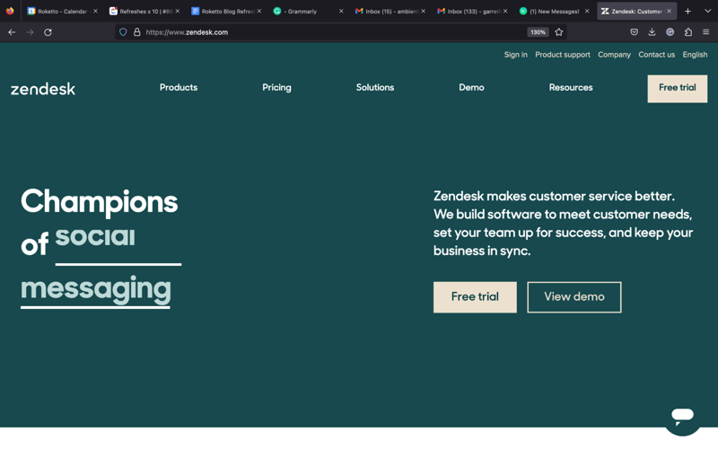
Strongest Element: General design
Simply put, most of Zendesk's designs are quirky, and we mean that in a good way. While they share some common elements with other SaaS websites, many are less conventional, like their colour palette—but it works well. The omnipresent peach colour promotes calmness in colour psychology, and the greens, growth and support. Their use of basic shapes is a persistent motif in both illustrations and photographic images and reinforces the concept of building blocks while also visually and conceptually blending reality with the digital world with ease, a recurring theme in their content. All combined, it ensures they get noticed and stands apart upon the first visit.
Other Strengths
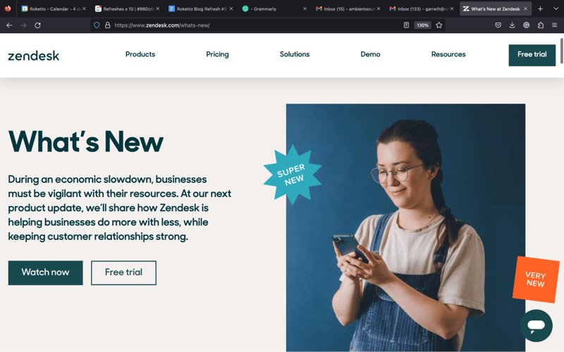
- Feature presentation: Because of the layout and formatting of the hover-over design of the features section, users have an intuitive platform to quickly explore Zendesk's myriad capabilities and benefits. It again uses the basic shapes motif and also uses simplified versions of the interface to showcase examples without too much distraction.
- Unique imagery: Outside of the motifs we've mentioned, using the same basic shapes in their photography shows they took great care in crafting their visual identity and clearly love subtext and cohesiveness, even when—or maybe especially when—it's quirky.
- All of the language speaks to their brand in that it promotes a happy, healthy, easy, and natural relationship with customers—and nearly everything on the site in terms of visual elements reinforces this as well.
- Navigation bar is logical, intuitive and points visitors to the most important and helpful areas of the site.
Xero
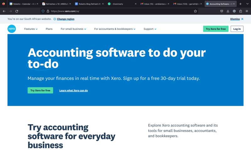
Strongest Element: “Beautiful business” exemplified
We'll try not to gush, but Xero absolutely nails their tagline at every turn. While light blue is their brand color, they take every opportunity to leverage lush, gorgeous colours in all of their imagery, which also happens to be custom and perfectly framed. In addition, the layout and flow of content are natural and intuitive, the spacing wastes little yet perfectly paces the information without being overwhelming, and all elements feel quite cohesive. It shows an attention to detail that few other sites ever really master.
Other Strengths
- Consistency: Because Xero offers a wide breadth of solutions and services to a vast expanse of business types, many of which are quite different in need, Xero inherently has a lot of information to provide—but they execute with precision. Pages of the same type, such as product features, business types, and customer stories, are highly consistent in presentation, quickly allowing visitors a logical map to where they can find certain types of information easily.
- Fun factor: Let's be real, unless you're into accounting, it's not fun or interesting (no offense)—but this website might make you think otherwise. Outside of colourful, compelling images, there's plenty of subtexts to imply how much easier and less stressful Xero's solution is—and the woman happily eating a popsicle instead of at a desk doing accounting is the perfect example.
- Explainers for all: Given how comprehensive Xero's solutions are, it's hard to understand everything, let alone be motivated to read it all. Having a minute-long explainer for almost every facet is a game-changer when it comes to the ease of getting informed.
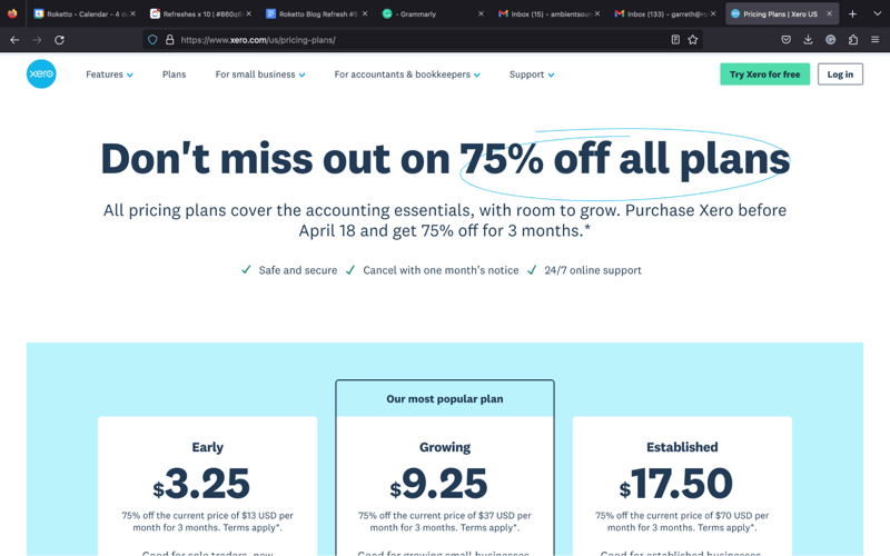
- No shy pricing: It's in the navigation bar and on every Business Type page. People want to know the price, and Xero isn't afraid to share it—and it doesn't hurt that the buy-in starts so low!
- Free trial at every turn: While having a CTA everywhere can feel pushy, Xero waits to deliver value with information, then reminds visitors how easy it is to try—which Xero also clearly realizes is one of the most compelling paths to conversion.
Best SaaS Web Design for: Knowing the Audience
GoodData
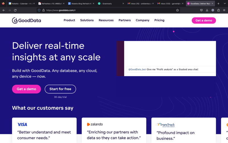
Strongest Element: Knowing their audience
In today's world, analytics are everywhere, and few seem to know that better than this SaaS website design inspiration. The top of GoodData's home page says it all. If the language and images visitors first encounter aren't examples enough, the fact that GoodData references Gartner, one of the most trusted sources of information, certainly is. But despite how deep data can dive, and how much insight it can provide, it's still often intimidating for a lot of people, and GoodData seems to understand that as well—everything about their design and presentation both simplifies and exemplifies the concepts around data-based business intelligence, making it digestible for just about everyone.
Other Strengths
- Social proof: Right under the header is one of the most compelling stats on their site—that “GoodData powers 50% of the Fortune 500 analytics.” We're frankly surprised they didn't highlight this more readily—it's pretty damn impressive!
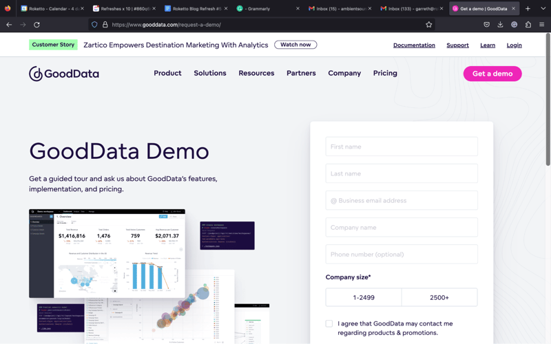
- Contextual illustration: With the header “GoodData - powerful analytics that goes beyond your organization”, their custom illustration that shows data as a centrepiece to every facet of business operations is key to putting their offering into a bigger and more meaningful context. It's even capped off with a universally appealing CTA: “Check what fits your needs.”
- Clear, concise, and communicative: Despite the intensity and complexity of how their solutions actually work and what they can do, almost nowhere on the site are copy blocks longer than a sentence or two, and a demonstrative image almost always accompanies them.
- Insight: Gleaning insight from data is common practice, but GoodData goes to great lengths to exemplify when it can be the most helpful and provides plenty of high-value information on how and why to apply it, as well as how it directly relates to business operations, which allows them to be helpful while also creating a need.
- Conceptual contrast: Staring at graphs and data isn't always easy on the brain or eyes, but this darkly-designed and keenly executed site is easy on both—which, in turn, says a lot about their offering.
HubSpot
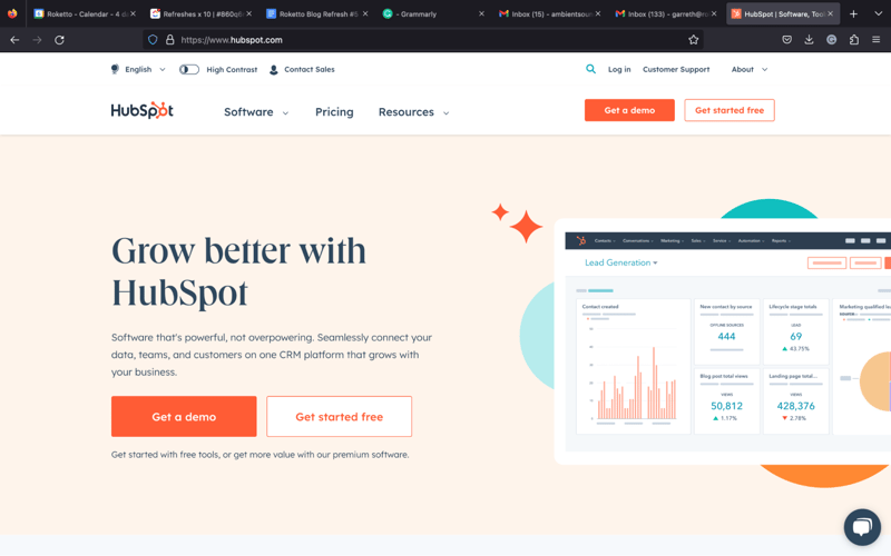
Strongest Element: A true value prop
Outside of the compelling design of their website overall, the company does two things exceptionally well: prove that they wholeheartedly believe in the HubSpot inbound methodology of maximizing the customer experience and positioning themselves to help businesses grow. On their homepage, they do both with genuine authority. Landing here alone gives you two options to get HubSpot free without even scrolling, but if you do or hit the nav bar, you'll find even more opportunities to do so. They are truly an industry standard from head to toe, and you'll be hard-pressed to find an area where they don't excel.
Other Strengths:
- Double value: Not only do they offer low or even free buy-ins, but they round it all out with one of the most comprehensive training programs around—and they're not afraid to show it.
- Visual identity: The overall cohesiveness of the site is created by its unique illustrations and matching stylized graphics cemented by their characteristic orange. No matter what page you land on, you always know what site you're on based on those alone.
- Understanding their solution's context: Throughout the site, you'll notice there's quite a bit of focus on integration. Much like the rest of their messaging, whether with copy or visually, they consistently reiterate the ease of use and integration so as not to disrupt operations but to help refine, bolster, and supplement them.
- Highlighting support: The navigation bar alone tells you all you need to know about what HubSpot is trying to do. They give folks links to their various hubs, a quick link to pricing (also directly stated under the software tab), and resources. That makes a trial run an easy choice for most people, as it's free and offers plenty of free support, self-driven or otherwise.
- Social proof: Near the bottom of the home page is compelling statistical proof that HubSpot is a success for businesses big and small—and that their support goes beyond the software itself, including their Inbound event, Academy, and Connect.
Best SaaS Website Design Inspiration for: Creative and Contextual Brilliance
Twilio
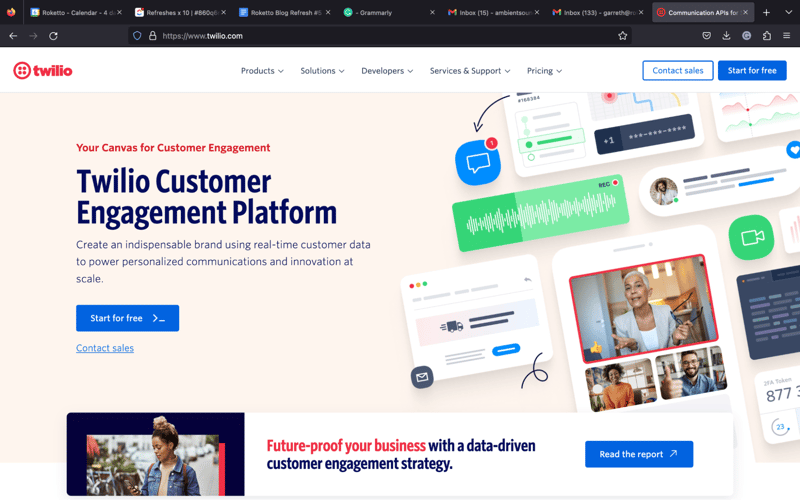
Strongest Element: Interactive example
We'll go over some important elements of this SaaS website design inspiration approach below, but it is absolutely impossible not to take notice of what they've executed perfectly on their home page: taking their offering and making it truly interactive from the get-go. In four easy steps, Twilio shows you just how easy a seemingly complicated process can be just by using your cell phone to send a couple of text messages. Not only is it exemplary in terms of its solution, but it's simple enough for almost anyone to do—and fun to play with at that! Giving users this mini sandbox generates interest with simple curiosity and use, and while it won't likely leave you yelling, “Content and imagery be damned!”, it certainly makes a strong case that encouraging the user to put the solution right in their hand is absolutely one of the most compelling ways to catch their attention and convince them to move forward.
Other Strengths:
- FUN!: While you do have to click through the Docs & Tools menu to get there, there's a training program for internal operators of their solution… in which they train people using the Python programming language through a legit 8-bit game to improve usage. That's seriously about as good as it gets for generating engagement and loyalty while allowing users to get an even better experience out of their offering.
- Social proof: From the scrolling header of their home page to nearly every link in the nav bar, Twilio provides copious amounts of social proof from some big names, from Lyft and 1-800-flowers to Twitch and Nordstrom, all of which are heavy on customer service and exemplify just how well their solutions work.
- Understanding identity on multiple levels: The average visitor may or may notice, but Twilio takes careful note of placing underscores—an integral part of some programming language—throughout their copy. To those uninformed, it may just look like a quirky motif, but to anyone with programming knowledge, it's a hint at their ability to fully customize solutions.
- Language: Twilio powerfully leverages language at every turn. Phrases like “Let's talk about how you talk to your customers” is perfect for introducing their explainer video, while “start building” works on multiple levels in terms of both building relationships as well as solutions (and/or APIs) to help businesses communicate more effectively with their customers.
Conclusion
As you can see, not all of the best SaaS website design inspirations are similar, let alone perfect, in terms of aesthetics or functionality, but they all share one thing in common: awareness.
What makes up a large portion of some of the best designs are those that truly understand their audience and know how to present themselves compellingly, bridging the gap between business and customer while providing a seamless and helpful experience that will leave an impression.
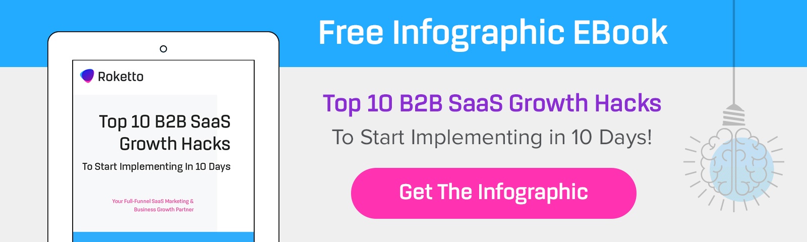
If you need help growing your SaaS business predictably, why not contact us for assistance? Roketto is a SaaS website design firm that can take your company to the next level, whether it's development, content creation, or techy upgrades, we have you covered.
Share This Article

2.png)
2.png)