


In the world of SaaS sales businesses, conversion is a fickle thing. Given that your website is your virtual storefront, having the wrong colour button, the wrong placement, bad scrolling, too many distractions, a clunky experience, and so many other factors can all compromise your ability to get customers-even ideal customers-well-informed, through the flywheel, and committed to your solution as a happy, successful user.
In the world of SaaS sales businesses, conversion is a fickle thing. Given that your website is your virtual storefront, having the wrong colour button, the wrong placement, bad scrolling, too many distractions, a clunky experience, and so many other factors can all compromise your ability to get customers-even ideal customers-well-informed, through the flywheel, and committed to your solution as a happy, successful user.
While there are still plenty of folks oblivious to the fact that presentation and experience are just as important as the offering itself, those who are the most successful understand that having a killer SaaS landing page can make all the difference between average industry ROI and a conversion rate that stimulates meaningful growth.
While every business should play to its direct audience and brand to maximize success, many of the best SaaS landing pages share some important qualities-more specifically, they share equal parts functionality, aesthetics, and psychology when it comes to design.
But coming up with something that leverages all three aspects AND aptly delivers your offering is a tall order, which is exactly why we've decided to put together this post-to give you the type of SaaS website design inspiration and analysis that will hopefully help you make your own informed decisions when coming up with your first page.
Criteria for a Good SaaS Landing Page
Clear Value Proposition
Explain to the customer the importance of a product or service with clear value propositions on the SaaS landing page and show them how your organization differentiates from competitors. One of the best ways to do this is to be succinct in telling prospects what the software does, who it's for, and why it is needed.
|
Benefit |
Description |
|
Increases Clarity |
A clear and concise value proposition helps visitors understand what a SaaS product does and how it can benefit them, increasing the likelihood of them signing up or taking action. |
|
Improves Conversion Rates |
By highlighting the key benefits of your SaaS product upfront, there's a greater chance of visitors converting to paying customers, leading to higher conversion rates and more earnings for your business. |
|
Reduces Bounce Rates |
A strong value proposition aids in reducing bounce rates by ensuring that visitors understand what your SaaS product does, encouraging them to explore your site further. |
With a well-crafted value proposition, you can stand out from the crowd while helping to attract and convert visitors into dedicated patrons of your brand.
Simple Clean Design
Visitors want an intuitive experience when engaging with your SaaS landing page; otherwise, why would they hang around? It pays to have a clean and simple design that isn't cluttered with a clear hierarchy of information to increase conversions by reducing confusion and boosting clarity.
Social Proof
Including social proof elements, such as logos, customer testimonials, or case studies from well-known clients, can help to establish trust and credibility with prospects. The likelihood of conversions increases by showcasing that other people have had a positive experience with your software.
Mobile Responsive
What would a landing page for SaaS be if it were not mobile responsive?
Pretty unsuccessful, we'd say.
With over 3 billion people accessing the internet from their smartphones, it makes sense that you want a mobile-responsive SaaS landing page. A mobile-friendly design ensures the page looks great and is easy to use on a smaller screen, leading to more potential conversion from mobile users.
Minimal Form Fields
Consider including only essential form fields to increase conversions and reduce friction on a SaaS landing page. By asking for only the necessary information to convert visitors into leads, a business can reduce the perceived effort required to sign up and turn them into paying customers.
Clear CTA
How do visitors know what to do next without a clear and prominent call to action? Use action-oriented language and a central placement to increase the chances of people following through with booking that demonstration.
Best SaaS Landing Page Examples
Best SaaS Product Landing Page for Simplicity and Transparency: Xactly
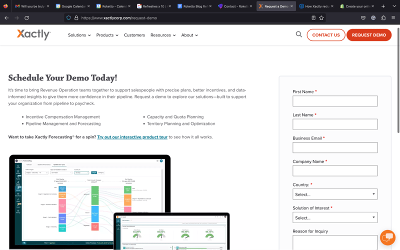
Let's be real: hunting for a solution to your problem is rarely a fun job. Even if you find a few options that work, you know exploring those options could mean slogging through sales pitches and generic motivational jargon, lengthy videos, lots of reading, and more. But that's where Xactly's SaaS landing page example straight nails it.
To first put it into context, there are far too many SaaS landing page designs that feel a bit too cloak and dagger. They're either too vague, trying too hard to rope you in, or don't really explain what happens procedurally after you submit their form-and then the obsessive calls and emails start and you want to crawl under the first rock you find just to hide from it all, if you don't smash your phone and computer with it first.
Xactly's choice of design does the opposite. It's one page. One form. No frills. No weird questions. And best of all, it eases that potential pain point by explaining exactly (get it?) what steps come next. Sure, you may get the exploratory call, but it will focus on you and what you need. Then that information will help define the custom demo. Between the two, Xactly will be able to deliver recommendations on how to get started, should you choose to proceed. All of that combines to make the process easy and, more importantly, enticing.
Other Strengths
- Overall design: The design itself plays to both the name and branding. It's simple, clean, and much like the next steps: exact.
- Name game: If you want to leverage some name value, why not use your previous honors bestowed by one of the best in the business, like Gartner, to ease people's minds when it comes to trust?
- Reasoning: Like Eventbrite, Xactly uses a qualifying question as their last: Reason for inquiry. This kind of open-ended question speaks to creating a better understanding for both parties-and it's mutually beneficial. The more the form-filler says, the more time SaaS marketing teams can contextualize communication before it's even begun, thus saving time and energy on figuring out what direction future conversations need to go to be helpful.
Best SaaS Landing Page Example for Trim, Fit, and Tidy: Shopify
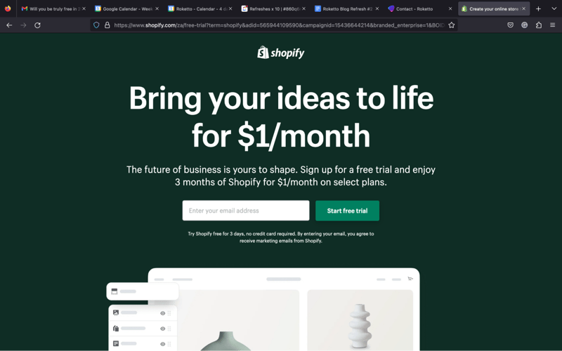
Email address, password, store name. Can Shopify make it any easier to sign up? Not only is the sign-up process simple, but the overall design of the site makes for a really pleasant user experience that doesn't feel too salesy-even though that's exactly what the product is meant to do: provide a platform to drive sales. Everything about Shopify's presentation on this SaaS landing page example tells the visitor everything they need to know to feel compelled to convert.
Other Strengths
- Distraction-free: The design, top to bottom, is only meant to highlight a few key elements and nothing else. Even the images used on this landing page are simplified to reduce distraction.
- Subtlety: The images themselves actually add some sales value without the need for any text whatsoever. The image on the laptop showcases the simplicity and functionality of a digital storefront while the image on the phone shows that it also provides analytics and, just as importantly, mobile support.
- Compelling case: Outside of the headers and subs, it takes only three copy blocks to really sell Shopify's offering, which, again, speaks volumes to the visitor. One outlines how easily you can design and customize a beautiful layout. The second shows that they're not afraid to talk about the cost and set a reasonable price floor-a big factor for many retail operations. The third removes a pain point by telling visitors Shopify handles all aspects of sales, from marketing to shipping. It's a perfectly lean yet well-supported pitch.
- Bookended CTAs: This LP has two different colored CTAs that are also in distinct locations (which can be tested) and reminds folks at both the top and bottom of the page that their solution is only one click and a few text fields away from testing-and with any luck finding-a new solution.
Best SaaS Landing Page Design for Personalization and Exemplifying Value Prop: Domo
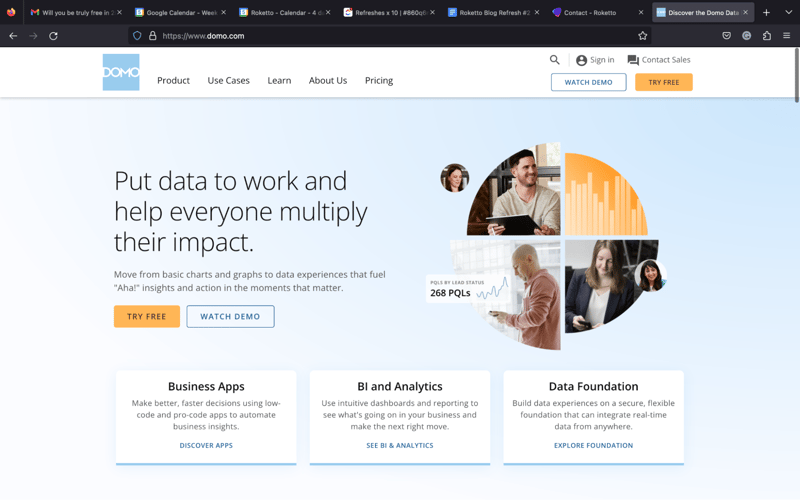
If there's one thing Domo does exceptionally well with this landing page, it's certainly a focus on the customer. Not only do they explain that their free trial incorporates the user's data from the get-go instead of a hokey, generic demo that showcases all of its -neatest- or most helpful features, but Domo even outlines exactly what you'll be able to walk away with after your 60-minute onboarding session.
All the language on the page speaks directly to the visitor, using a lot of 'you' perspective and in addition, provides what you'll be able to accomplish in a short amount of time. It's not just a great way to exemplify their Proof of Concept but frame their free trial and their offering in general. They even encourage continued exploration afterward to make sure trial users get first-hand experience figuring out how and why Domo can solve a lot of their current pain points.
Other Strengths:
- A lasting impression: Because Domo isn't offering a blanket demo and shows trial users how to leverage their data from the start, they're providing value regardless of whether or not that user converts. Even if they don't, they still walk away with insights they didn't have previously as well as a process that has already been outlined for them for repetition in the future, making the prospect of buying in that much more enticing. And this LP is the perfect place to house all of that promise.
- Versatility: This might be an overstatement, but have you ever seen a more diverse group of successful clients than eBay, DHL, The Honest Co., and Univision? This gives the immediate impression that industry is no boundary, implying that whoever the visitor is, they can rest assured of finding similar results, no matter what field they work in.
- Integration: When it comes to analytics, integration is a key pain point, so although it's not shown in the photos above, just below those are links to some powerful SaaS allies like Google Analytics and Salesforce, again showing that the barriers to entry and success are nearly non-existent.
Best SaaS Landing Page Example of Easy Yet Comprehensive Support: Marketo
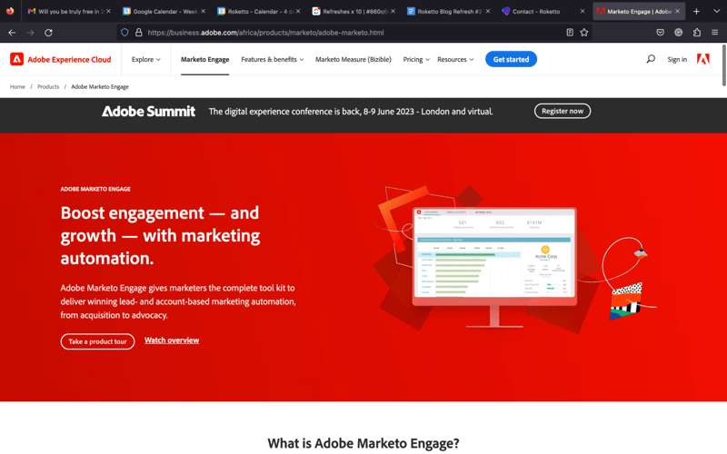
While other landing page spreads need multiple images to showcase their power, Marketo's does not. It's important to point out that it's not that we find this LP perfect, but more so that we believe that they're aptly leveraging an important element that goes beyond the offering itself: support.
Whether it matters if users are familiar with the Adobe family of products is still up for debate, it's clear that whoever visits this landing page will get the idea that they're getting a 2-in-1 package with their sign-up. Not only will they get an easily digestible 4-minute intro demo, but access to an entire video library. While it may not be immediate and direct hands-on support from an expert, most folks want an easy way to learn a potential solution at their leisure, and not having to commit to a meeting might be what best suits their need.
Other Strengths
- To the point: Everything the visitor needs to see-barring the other successful customers mentioned below-is displayed on-screen upon first arrival. There's no need to scroll, which therefore limits opportunities to get distracted.
- Design: Attractive, simple, and plays too many other design concepts Adobe regularly practices-which shouldn't be a surprise given their industry.
Best SaaS Landing Page Inspiration for Rockin' and Scrollin': Dropbox
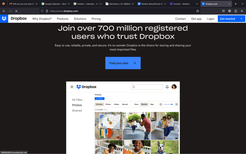
Normally, we wouldn't advise a long-scrolling landing page, but Dropbox has hit the nail on the head by combining its home page with a veritable LP. Obviously this won't work for a wide variety of folks, as there are generally too many opportunities for distraction when so much information is contained on one page but it works exceptionally well here for a few reasons.
First, given that the concept behind the offering is simple, it's not hard to explain how it's helpful in just a few pages and images, and it becomes more compelling the more you read their succinct copy blocks. Second, all signs point to sign-ups or sales. Even the CTAs that don't link to a form link to other informative pages-which, in turn, also link to the opportunity to sign up or buy. Everything from here funnels down the same way, so little gets in the way.
Other Strengths:
- Aesthetics: Straight up, this is one of the nicest-looking LPs of the bunch. Clean yet comprehensive, easy on the eyes, surprisingly satisfying to scroll through, and purposeful. It's a win for both sides.
- Pull-away form: Once you start scrolling down, the form itself slides off the page to make room for everything below without making it all feel too salesy or pressured and gives the impression that the information below is valuable-which to any new visitor, certainly is.
- CTA buffers: Even though the form disappears and reappears near the top, Dropbox still uses CTAs at the bottom to direct visitors to a try and/or buy page, but also offers up two selections, one for personal, one for business, making it feel like a more tailored solution for both.
- One-click sign-up: Having direct access to sign-ups through Google makes it easier on the visitor and showcases the overall ease of use and integration.
Best SaaS Landing Page Example of CTA and Informational Balance: Zoom
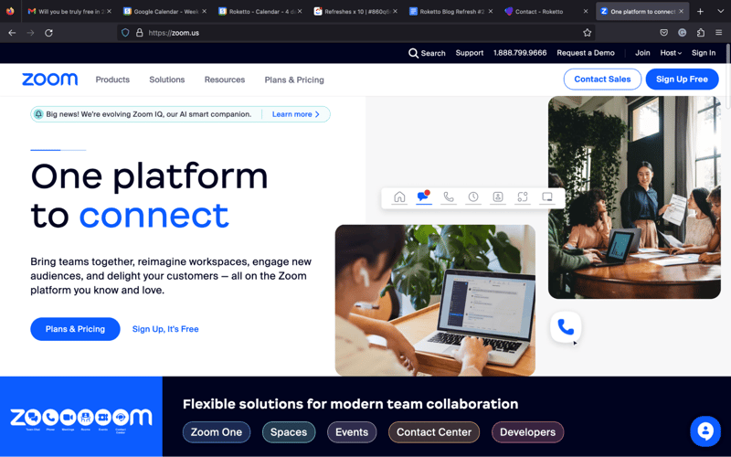
Much like Dropbox, we can't condone a long scrolling landing page for every SaaS, but here's another example of doing it the right way. The approach works here because Zoom actually goes back and forth between showcasing the strengths of its offering with CTAs and form fields. It opens with a clean, simple interface and a singular form field accompanied by its greatest asset: a nice UI and high-functioning video conferencing.
As you scroll further, however, visitors can see how it works, why it's a great option, and that it's supported across numerous devices. Then they're met with more tasteful links and CTAs and a pricing structure. Then they get to see a feature breakdown and social proof before hitting the end of the page. All the while, that subtle, single-field sign-up form hangs onto the bottom of the browser before again anchoring itself at the bottom. It's a balance that provides info, then access, info, then access, reminding visitors it's just as easy to learn about it as it is to convert-even if it's just a trial.
Other Strengths
- Visuals: Between the color scheme, beautifully formatted real images, and tasteful touches, it's a really nice experience just to be on the page and shows a lot of care was taken in creating a nice customer experience-which, in terms of subtext, also says a lot about the offering itself.
- Different CTAs: While the sign-up form feels simple with just one field, requesting a demo takes you to something more complete without feeling overwhelmed since you've already committed to providing at least one bit of information as part of the process. Plus, that secondary form even includes an "Additional info" field for better context.
- Pain points: A lot of the copy on the LP touches on user pain points, which most users of video conferencing software are likely -painfully- familiar with, making this offer that much more compelling.
Best SaaS Landing Page Example of Multiple Access Points: Apptio
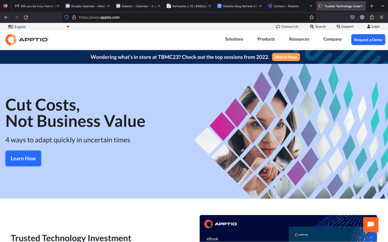
Not all aspects of a SaaS marketing strategy speak to people the same, even if they're technically under the same buyer persona-but that doesn't mean anyone really notices or takes advantage of it. People don't often like being sold to, so providing additional options that sound or feel less sales-driven can make all the difference in getting prospects on the path to conversion, and Apptio's landing page is a great example of that.
Notice how the four options at the bottom of the page create four different ways to start engaging with the brand and offering-and the more you explore, the more you find out, they overlap. Ask a Question opens up a chatbot that offers the option to speak to a human but it also offers the ability to book a demo. Find a Solution brings you to a page filled with more information about how and why Apptio works and even includes social proof. Book a Demo is easy, direct, and self-explanatory. And Join an Event takes you to a page of webinars and similar offers-all of which eventually take you to additional LPs/forms. Together, multiple personality types and flywheel stages can be satisfied and helpfully direct users to the next steps.
Other Strengths
- Color theory: The toothpaste blue/green feels fresh, the deep blue is clean and organized, and the orange-saved for CTAs-is eye-catching and stimulating.
- Subtlety: Ideally, you can see the page was designed to be distraction-free, as it's short and simple. You don't even notice the four options at the bottom are actually links until you read them and hover over them, so anyone who doesn't notice may still fill out the form thinking it's the easiest next step, while those unconvinced will end up with more helpful information-and more conversion opportunities.
Best SaaS Landing Page for Information Navigation: Github
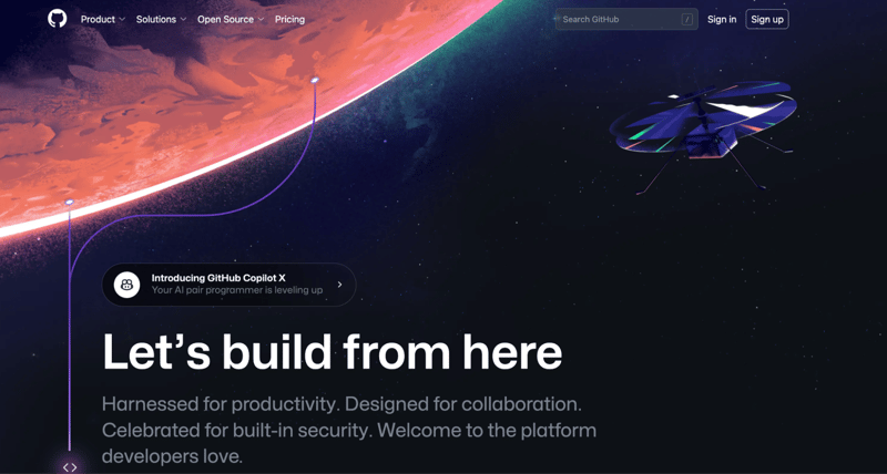
We swear we're not trying to develop a theme here, but this is the final example of a long, scrolling landing page/home page combination that works, despite its few flaws. Frankly, it's a lot of information. There are myriad opportunities for distraction. And it's long. But it's a complex and comprehensive offering, and not addressing many of these facets would keep most visitors from signing up in the first place. After all, you want to understand the offering entirely if it's going to solve numerous facets of your business processes-especially if they're complicated!
There are really two options for visitors: to explore or sign-up. Even the navigation bar says as much, considering Why GitHub? and Explore are balanced by Pricing, Marketplace, and a Sign-up CTA. Even though the initial form visitors land on is clean and to the point, anyone who is not ready to commit certainly needs more information. And although this page is sprawling and a bit wordy, it does a good job of creating intuitive navigation for anyone who needs to more thoroughly understand the capabilities of the offering, making exploration an essential part of the conversion process.
Other Strengths
- Strong features: Providing the right information and intuitive navigation is one thing, but the fact that anchored at the bottom of every page is an attractive pricing breakdown complete with CTAs shows that GitHub still knows how to get down to business and remind visitors that if they've gotten the information they need for the time being, it's time to dive in and try it out.
- Nice execution: Although there is half a novel of information provided throughout the site, the individual page designs and breakouts rarely cause fatigue. There's a nice balance of copy and visuals, explanations and example images, and spacing to boot.
Best SaaS Landing Page Example of Clean, Classic, and Button-Happy: Anaplan
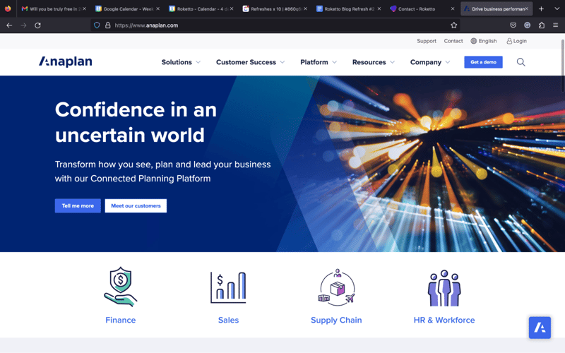
A majority of Anaplan's landing page is made up of some simple, effective elements. Good language, a straightforward form that hits you right after clicking the demo request button, and a succinct outline of how and why Anaplan works. But the supplemental pages add some strength to their flywheel.
In particular, scrolling past these two segments will land you in a nicely-designed area of social proof in which you can click through to explore, by video or text, the case studies of clients who have also found success with their solutions. But just as important are the two buttons that follow you at the bottom of your browser window: Get Demo and Contact Us. This allows the user to peruse the site, find the evidence and explanations they need to see if it's a decent fit, then have immediate access to take the next step. You can even easily navigate through different clients, all without losing those two buttons-or in the eyes of Anaplan, focus on going from theory to hands-on.
Other Strengths
- Color use: At no point in navigating the main landing page or otherwise are you able to overlook the bright pink CTAs to help you towards the next step in the process.
- Limited navigation: Outside of the navigation bar itself, individual pages don't often, if ever, link users to any sections other than a social proof/success stories, limiting distractions when soaking up information or moving onto the demo stage.
SaaS Landing Page Best Practices
Keep it Simple
A landing page should be easy to navigate and understand, with a clear value proposition and concise explanation of the product's key features. Don't clutter your SaaS landing page with extraneous design elements or too much information that can overwhelm visitors. A prominent SaaS landing page builder and template can help take the pressure of design work.
Use Strong Headlines
Grabbing a visitor's attention and keeping them engaged to continue reading the landing page begins with a strong headline. Focus on the advantages of the solution and ensure you deliver it concise, easily digestible manner.
Highlight Benefits
Instead of just listing features, concentrate on how your product helps potential customers. Show your prospects how your solutions can solve their problems and make their lives easier.
Use High Quality Visuals
When highlighting the benefits and features of your product, using high-quality images or videos is recommended. Avoid generic stock photos like the plaque and instead utilize visuals that accurately represent your brand or product.
Make it Mobile Friendly
We discussed previously why a mobile-friendly SaaS landing page is imperative, but we can't reiterate it enough. Ensure your landing page is optimized for mobile viewing with text that is easy to read and buttons that are easy to tap.
Reduce Friction
Remove obstacles preventing visitors from converting, such as confusing navigation or overly complex forms. Prospects should be able to easily understand your product, how it works, and how to sign up for a demo or purchase it.
Use A/B Testing
If you're looking to optimize your landing pages, A/B testing is a powerful tool. Test different headlines, images, and calls to action to see what resonates best with your audience and drives the most conversions.
Continuously Optimize
Even after launching your landing pages, optimizing them to improve their performance consistently is critical. Monitor SaaS marketing metrics and use insights gained to make data-driven improvements to your landing page over time.
3 SaaS Landing Page Templates
SaaSLand
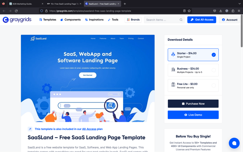
Do you want a free SaaS app landing page template specially crafted for WebApps, software, and SaaS? Then look no further than SaaSLand!
This SaaS landing page template comes with over 500 icons and is based on the latest version of Bootstrap 5.0. It has a refreshing, clean, modern design with multiple features and elements to customize the page to your requirements.
What's more, is that the landing page is mobile responsive and has an intuitive user interface.
Basic
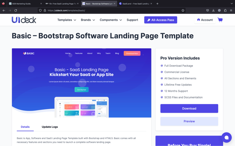
Built with HTML5 and Bootstrap, Basic has distinctively developed for SaaS, Software, and App landing pages. The template has fantastic animations and all the necessary features to create a stylish software landing page.
Basic is fully responsive and highly customizable due to being coded in a blocked-based structure. We recommend Basic if you want a simple template to kickstart your App or SaaS site.
Smart
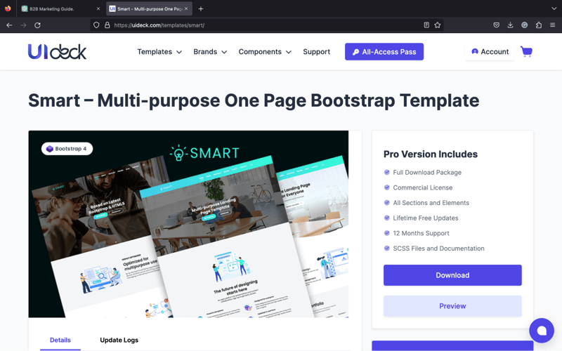
This multipurpose SaaS app landing page is designed with Aero UI, HTML 5, and Bootstrap 4. Smart is ideal for businesses wanting to create a SaaS landing page that'll spark the attention of prospects without overcomplicating things.
Moreover, Smart has all the key features and elements to bring your landing page to life, including CSS3 animations and three easy homepage variations.
With fast loading times, easy personalization options, and robust responsiveness, Smart helps convert visitors into paying clients.
SaaS Landing Page Examples - Final Thoughts
Landing page optimization for SaaS is no laughing matter, especially when wanting to drive conversions for your product. But that doesn't mean we can't have a little fun with it!
At Roketto, we take landing page optimization seriously.
We're not clowning around when it comes to crafting landing pages that are simple, visually appealing, and optimized for maximum conversion. We don't just juggle a few elements here and there and hope for the best. We use data-driven insights and A/B testing to continuously refine and improve our landing pages.
So if you're ready to take your SaaS landing pages to the next level, don't be a jester and try to do it all on your own. Contact Roketto's team of experts to be your ringmaster and help you create landing pages that are no joke in driving conversions and achieving your business goals.
Share This Article

2.png)
2.png)